
Comparing multiple sites in your Hyfi portal
The comparison view lets you plot water level data from multiple Hyfi sites on one chart so you can see how they behaved over the same time period. Each site gets its own color (and line style when many sites are selected). You can switch between elevation and depth, change the time range, and download the data as a CSV.
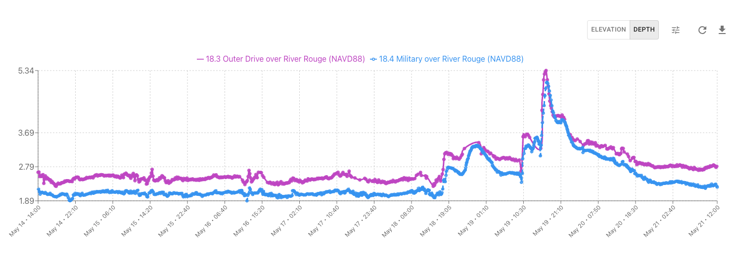
Table of Contents
- Overview
- Opening the Comparison View
- Starting from a Site Page
- Selecting Sites to Compare
- Reading the Comparison Chart
- Refreshing and Downloading Data
- Need Help?
Overview
You can compare up to 15 sites at once. Only sites on your team’s dashboard appear in the site list. After you choose sites and click Compare, a single chart shows all selected sites for the time range you pick.
Opening the Comparison View
- Log in to your Hyfi dashboard at https://go.hyfi.io.

- In the top navigation bar, click the Compare Multiple Sites icon (two arrows pointing at each other). The comparison view opens.

Starting from a Site Page
- Open any site’s detail page from your site list or map.
- Click the same Compare Multiple Sites icon in the upper right. The comparison view opens with that site already selected so you can add others.

Selecting Sites to Compare
- Under Select Sites to Compare, use the search box to find sites by name or site code. Click a site to add it. Selected sites appear as color-coded chips; each color matches that site on the chart.
- To remove a site, click the × on its chip
- When you have the sites you want, click Compare. The chart loads below (this may take a moment while data is fetched).
- If you try to add more than 15 sites, a message at the top tells you to remove one before adding another.
Reading the Comparison Chart
- After you click Compare, a line chart shows each selected site over the chosen time range. The legend lists site names and their datum.
- Use Elevation or Depth to switch what is plotted (same setting as elsewhere in the dashboard).
- Use the time range control (clock/tune icon) to change the window—for example Last 7 days, Last 30 days, or a custom start and end date. The chart updates automatically when you apply a new range.

- Hover over the chart to see a tooltip with each site’s value at that time. A vertical reference line helps you line up readings across sites even when sample times differ slightly.

- To add or remove sites after the chart is showing, change your selection in the search box. Data refreshes automatically while you stay in comparison mode.
Refreshing and Downloading Data
- Click the refresh icon to reload chart data for the current sites and time range without leaving the page.
- Click the download icon to export a CSV of the compared sites for the current time range. A spinner appears on the button while the file is prepared.
Need Help?
If you have trouble using the comparison view or do not see the Compare Multiple Sites icon, contact us at support@hyfi.io.